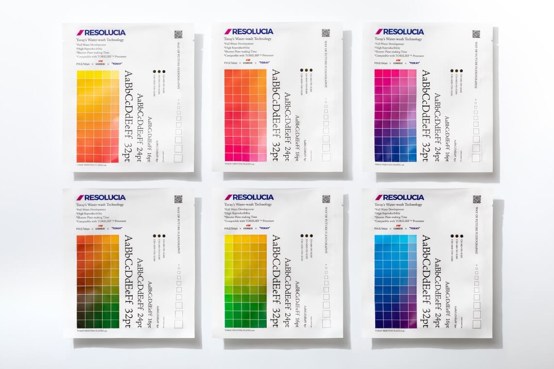

Design company P.K.G. Tokyo × Comexi × RESOLUCIA™
The Concept-Changing & Business-Growing
High-Definition Technology
Design company P.K.G. Tokyo × Comexi × RESOLUCIA™
The Concept-Changing & Business-Growing High-Definition Technology
RESOLUCIA™ Story 3Official Printing
"TORAY PRINTING PLATES Lab." is an experimental initiative to explore the possibilities of expression through TORAY's printing plates and lead to new creations. This series of articles will tell the story of how leading creators and partner companies met through TORAY's printing plates, stimulated each other, and worked as one team to reach their goals.
-
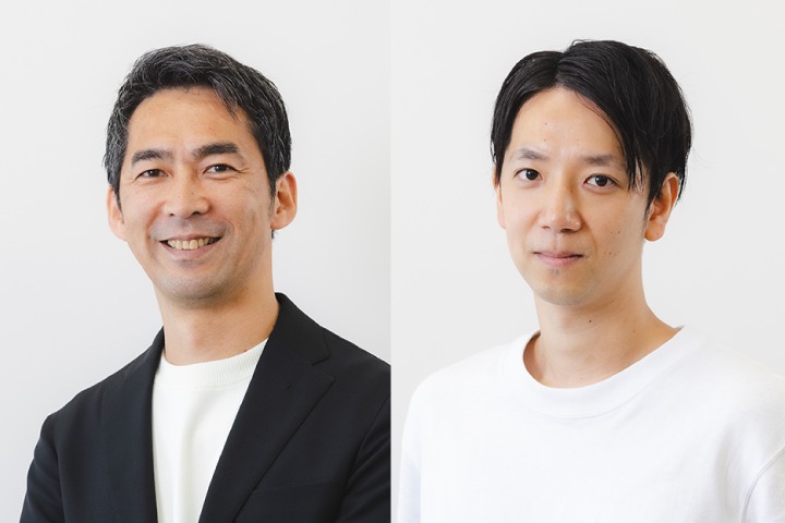
Participating Creator:
P.K.G.Tokyo
A brand management agency established in 2017 that specializes in design. The agency offers a comprehensive range of services for corporate, product, and service branding. These include research, strategic planning, product development, and web planning.
Additionally, the company actively participates in exploring and promoting a sustainable future through its P.K.G. Lab. together with companies. -
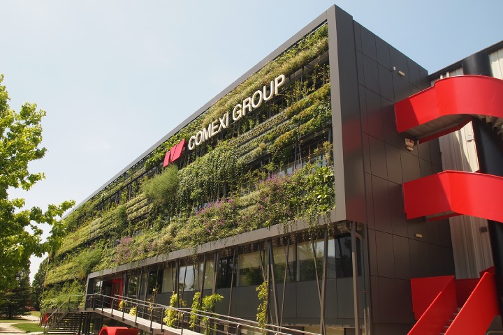
Partner companies:
Comexi
Comexi is a Spanish printing press manufacturer whose main products are flexographic presses for flexible packaging.
They offer a wide range of innovative solutions from printing to end of line automation processes, and also collaborate with EB ink manufacturer and promote EB printing system. -

Project team:
TORAY Development Team
The RESOLUCIA™ project team is responsible for developing a high-definition flexographic printing plate. This team operates within Graphic Systems Department of Toray Industries, located at Toray's Okazaki Plant in Aichi Prefecture. Our main objective is to enhance the quality of printing plates, aiming to make a significant contribution to society by creating high-quality plates that surpass the traditional standards of flexographic plate production.
-
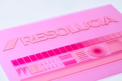
Printing plate:
RESOLUCIA™
Toray has developed advanced technology to enhance plate making and printing quality beyond traditional flexographic plates. This innovation not only improves reproducibility by enabling high-resolution of 200-line level, but also enhances production efficiency by reducing plate making time through full water-wash process. Compared to the conventional solvent-wash method, Toray's approach ensures superior results in terms of both quality and efficiency.


What should designers consider when creating with their desired colors in flexographic printing?
― It was an unbelievably stuffy day in June, the beginning of the notorious rainy period, when the pros from TORAY PRINTING PLATE Lab gathered at the office of P.K.G.Tokyo in Omotesando, Metropolitan Tokyo, to evaluate the printing on a pouch using the RESOLUCIA™ printing plate conducted by Comexi, a printing press manufacturer from Spain. ―
P.K.G. Tokyo Designer Amano-san (Amano): Thank you for coming all the way in such a baking hot day. So, here we go, we have got the pouch from Spain! We conducted a series of test runs before finally achieving this official printing, so today, let’s take a closer look at the outstanding printing result.
P.K.G.Tokyo Designer, Mr. Osada (Osada): Right. Looking back on the first trial, it was rather disappointing that the colors were not sharp, and we had the issue of decolorization. Later in the second printing, we successfully got sharper colors thanks to the change to another film, but still, we reckoned that it wasn’t the standard we aimed at, and that’s why we kept exploring ways to liven up in this final official printing.
TORAY Development Team (TORAY): True. In the second trial, we came to know that there were concerns about the colors of the text “UMAMI JAPAN” due to the order in flexographic printing, where ink is on top of colored ink. Colors are overprinted to create rich blacks in offset printing on paper, but the order is reversed in flexographic printing, so I believe the ink couldn’t adhere well.

Rich black text achieved through flexographic printing
Amano: Agreed. The colors in the second round were not something we expected. The colors of the words “UMAMI JAPAN” looked kind of different in different dashi broths; some other colors just gradually got in and altered how the “K” in “CMYK”. Could you please share with us how you solved the problem in this final printing?
TORAY: The order in flexographic printing can never be changed, so we tried working on the printing data as a way out. Osada was the person in charge of the adjustment indeed.
Osada: Yup. What I did was all based on the suggestion from TORAY that we might try to lighten the colors in the data so colors can get on and the ink can also adhere more nicely.
Amano: Yes, you did. So, K was in its full portion while the values of C, M, and Y were halved. As a result, the colors of K could look sharp and decent. On the contrary, the thick applications in C, M, and Y leave no space for K to penetrate. The point is to thin out the dots in them for easier penetration in K.
TORAY: That’s right. Your illustration is wonderful.
Amano: Alright, let’s take a look at the printing. First things first, the colors of the text “UMAMI Japan” we just touched on are much closer to what we were looking for, aren’t they? Examples include the combination of C15+M0+Y15+K100 for the orange-colored inks for shiitake mushrooms and C0+M30+Y0+K100 for the purple inks for scallops. They are exactly what we were looking for!
TORAY: We’re glad that we can meet the expectations of you designers!
Amano: The challenge was to create vampire black like rich black in flexographic printing through the same common way as in offset printing, such as in paper printing. I’m rather convinced that we eventually made it after the series of test runs. We’ve got the true, real rich black. It is the first time ever in flexographic printing that everything was under control. We are now able to cope with requests from designers, say, “I’m looking for the rich black with a taste of blue,” since we can adjust the percentage of C, M, and Y in flexographic printing.


The high-performance hurdle of "creating the precise colors of dried foods"
Amano: Let’s move on to the photos. Oh, the colors are attractively sharp! The food has a vision, and the vibrant colors make everything look exceptional. Dashi broth ingredients all look brownish, but the pictures nailed it. Your color touch-up put great emphasis on all small differences, so dark parts look darker, and the reddish do look red. It is indisputably a transformation.
Osada: The redness in skipjack tuna and small shrimp is especially fantastic. The shades of the soup stock, on the other hand, became so dark in color that I’ve got the impression of overtone at first glance.
Amano: Right, we lost the in-betweens. Yet, I have a good feeling that we can fine-tune individual images to solve the problem.
TORAY: Well, I guess different images come with different color tones, and since we have revised all the data so some pictures look great while some are undesirably awkward.
Amano: Oh, really? Maybe you are correct. Personally, I am so in love with the appearance of the shiitake mushrooms. It looks so authentic…Or I should say, you guys utilized the true power of the inks. Last time, it looked so pale, but now we have got the “true colors” of Shiitake.
Osada: Maybe the kombu kelp looks too bright. Brightness works positively for almost all other ingredients, while for kombu, it brings in a wrong impression of a raw odor and scum.
Amano: Dried foods all look brownish, but the illustration was amazing. I believe it’s not an easy task. I love the way you guys keep aiming higher in the process. It was an enjoyable experience working with your team, and I’d say we found a huge success this time picking up the challenge.
TORAY: It wasn’t easy at all! The difficulty comes from the fact that food packages always come with bright and sharp colors. In that sense, Comexi, the Spanish printing agency with a completely different cultural background, also commented that they were not quite sure what the food ingredients were, but they felt satisfied with photo development.

The photo sections with more vivid and well-defined colors
Printing Samples revealing the true potential of RESOLUCIA™
Amano: Frankly speaking, I’m not familiar with flexographic printing… Is the high definition we achieved this time common and natural?
TORAY: I’m afraid that we don’t have samples with such a high definition around, so it is not common. I would say it’s the very first time we realized that we could create such a high definition in flexographic printing. It should be, in fact, our selling point that we didn’t know.
Amano: Right, what we were doing was unusual and unique. Is that so we can conclude the challenge we picked this time has become a remarkable milestone for our future?
TORAY: You know, an international exhibition on food packaging and labelling is occurring in Spain this September. We are going to participate and hold a booth. So, we would love to bring a sample of the printing this time for promotion!
Amano: No way! Isn’t it too late for me to book a ticket to Spain? (laughter) Anyway, it would be great if we could do extensive promotion for flexographic printing locally in Japan as well.
TORAY: When compared with flexographic printing on flexible packaging, rotogravure (gravure; intaglio printing) is still much more common not only in Japan but in the entire Asia continent. However, I believe the popularity of flexographic printing will drastically rise in terms of sustainability.
Amano: Small steps for big changes! Gradually, the value of flexographic printing will also change in Japan in the next decade. Thanks for accommodating our requests from the designer’s viewpoint this time that we can pride ourselves on having such a high-quality printing standard in RESOLUCIA™. The flexographic printing technology is becoming essential for both the national and international development in Japan and Asia. This project means a lot to us as designers, too.
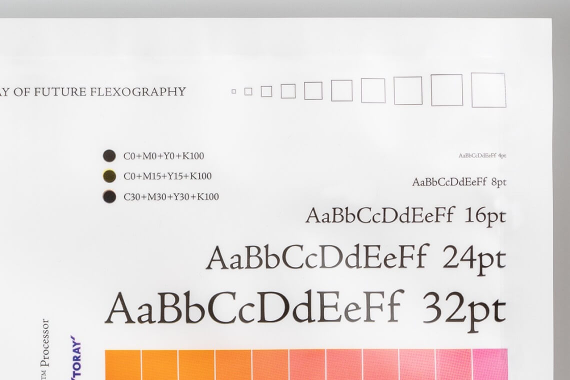
The text and lines are printed cleanly and precisely
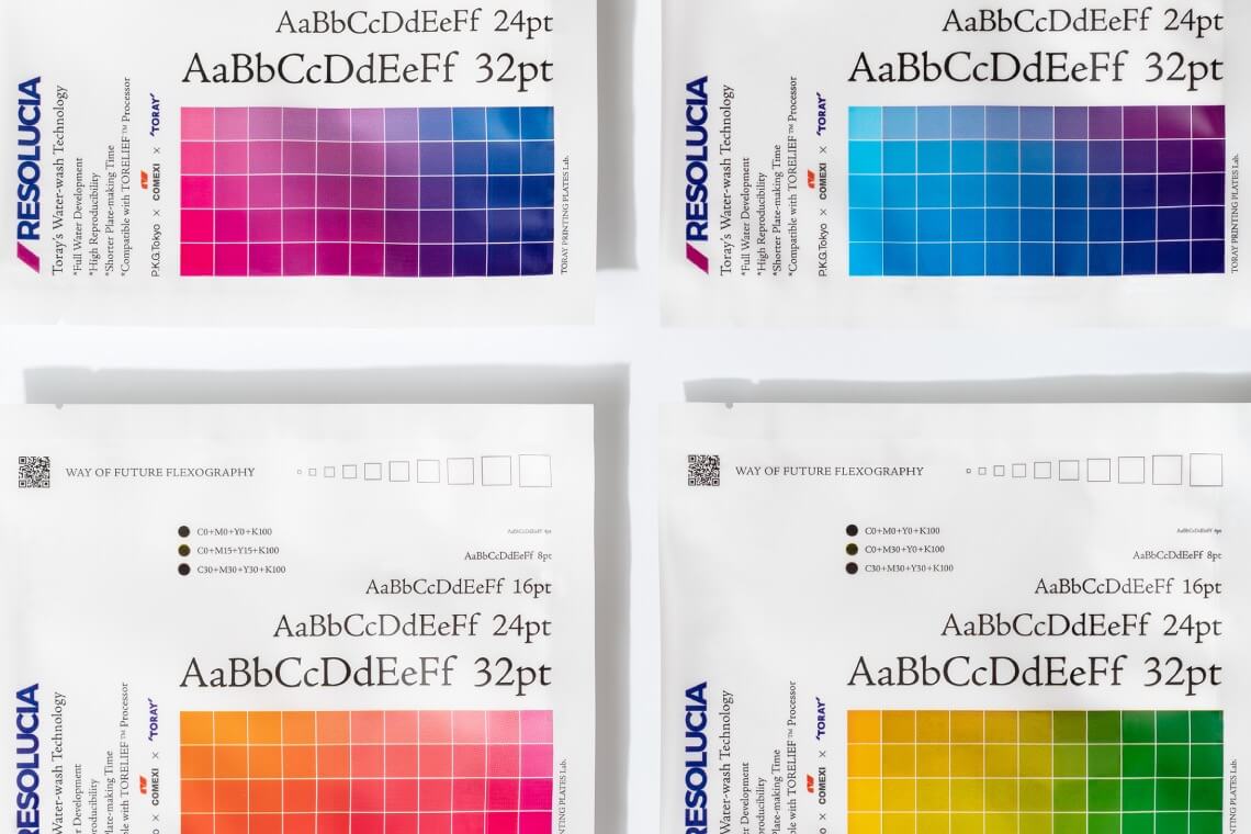
Subtle color tones are finely reproduced
Summary: Creating a niche for flexographic printing for more future businesses
Amano: Through the precious experience in this project, I have a good feeling that your excellent RESOLUCIA™ plate will soon become well-known and much-loved. It is revolutionary in concept and pioneering in the development of flexographic printing. And, I found it fascinating to get to know that the role of flexographic printing can be such different nationally in Japan and internationally in the global market. The requirements in both printing quality and quantity are not as strict as those in the European market. The trending technology is in high demand there, so the market itself is expanding at a rapid rate, and things are progressing. The experience of witnessing the advancement of high-definition flexographic printing turned my understanding about printing in Japan and the global market entirely upside down.
Osada: The labelling at the back of food packages is too small, even on paper, not to mention on a pouch. We tried, and yes, we managed to make all the details, including all the lines and the distinctive color contrast in the color wheel. The accuracy is so high, and pictures are so realistic that you simply cannot believe it is flexographic printing. It is comparable to rotogravure. I believe that the next step is to work on the value of pictures on product packages as we can communicate even more product value using photos.
TORAY: Could agree more. We’re pleased to present details in photos in such high definition through flexographic printing on flexible packaging and fulfilling the dreams of designers. We are looking forward to seeing more positive feedback from our customers when we present our technologies in upcoming exhibitions. Also, from a business perspective, we, TORAY, are paying close attention to flexographic printing technologies as the trend is moving towards mono-materials. We would like to pursue the potential of flexographic printing, find its niche, and create more big business opportunities.

